Applies to: Safetica On-Prem
In this article, you will find:
- Introduction
- How to integrate Safetica with a data analysis tool
- How to disable the integration
- Power BI report templates for Safetica
Introduction
Safetica can use its data analytics API to integrate with third-party data analysis tools (such as Power BI, Tableau, and others) so that you can create more flexible reports.
You can connect your Safetica database to your data analysis tool and retrieve analytical data from Safetica records. If you have other data sources connected to the tool as well (e.g. your company HR system), you will be able to group the info from the records into any organizational structure tailored to your needs.
To make the integration even easier, Safetica provides their customers with two predefined report templates – the Activity Dashboard focused on user activities, and the Data Security Dashboard.
How to integrate Safetica with a data analysis tool
In Safetica, you can integrate your Safetica database with a data analysis tool by creating a new database account (user + password). To do that:
1. Open the MS SQL server command line and run the following command with the appropriate permissions:
EXEC [DataProvider].[CreateDaUser] @password = N'your_password'
The strength of the password must correspond to your SQL server configuration.
2. After the command finishes and the database account is created, you can open your data analysis tool and add a new data source.
3. Fill in your credentials:
Username: safetica_da
Password: the password you created in step 1.
4. Afterward, the database is connected, data is loaded, and you can start creating a report. You can either use one of our report templates or create your own visualization of the data.
✍️You can download our report templates here.
Details necessary to create your own visualization can be found here.
How to disable the integration
To disable the integration of Safetica database with your data analysis tool, you must delete the created database account.
Open the MS SQL server command line and run the following command with the appropriate permissions:
EXEC [DataProvider].[DeleteDaUser]
Power BI report templates for Safetica
You can streamline your integration with the help of two report templates you can get from Safetica:
- the Activity Dashboard - learn more about the Activity Dashboard here.
- the Data Security Dashboard - learn more about the Data Security Dashboard here.
Just connect these report templates to your database and populate them with data from your records.
✍️An example of how to connect your report templates to Safetica database in Power BI can be found here.
Download templates for the newest Safetica (11.2.24) here:
|
ActivityDashboard.pbit (November 21, 2023) |
|
|
DataSecurityDashboard.pbit (November 21, 2023) |
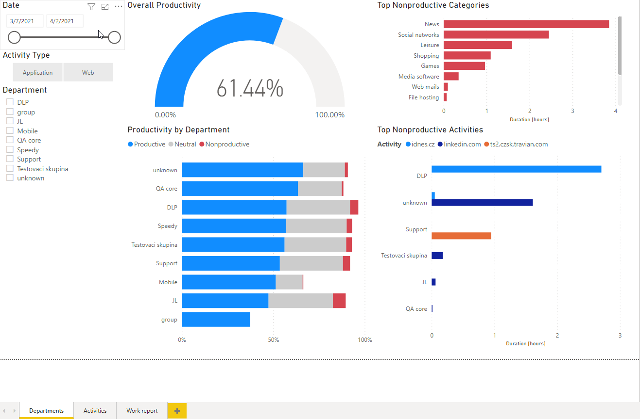
More about Activity Dashboard
This report template focuses on user activity and remote work and you can filter it by time range, activity type, or departments.
The Activity Dashboard is divided into 3 sections:
- Departments – you can see at first glance the overall productivity of all your users or of individual company departments.
- Activities – focuses on specific applications and websites and highlights those that might create problems in the protected perimeter. You can see the most common productive and nonproductive activities.
- Work report – this report can be used for remote work control during home office time. You can see for how long individual users have been logged into their computers – and for how long they have been actively using them.
An example of Activity Dashboard in Power BI:
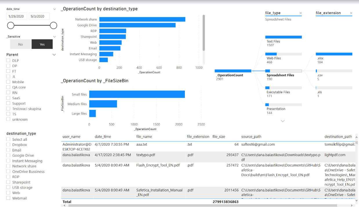
More about Data Security Dashboard
This report template is based on file operation logs. Only outgoing files are taken into account.
The Data Security Dashboard is divided into 3 sections:
- Dataflow – you can see which files are leaving and where (RDP, Web, E-mail, IM, USB, etc.) and also their sizes - small (smaller than 100 kB), medium (100 kB - 1 GB), and large (larger than 1 GB). You can filter time range, individual channels, and file types. You can also switch between displaying all files or just sensitive files (i.e. files that have a data category assigned).
- Network shares – an overview of what file types can be found on which network shares. This section can also be filtered by time range, file type, and sensitivity.
An example Data Security Dashboard in Power BI:
FAQ
Q: Can I connect Power BI to Safetica Platform?
A: No, power BI and other data analysis tools can only be integrated with Safetica On-Prem.